The other day I was working on a cards report for a customer and they wanted to have the cards on the same line be of equal height. They also wanted to have some kind of visual indicator of what card was currently being hovered.
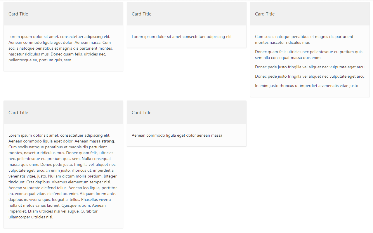
Here’s what the built-in card report looks like:

First, let’s have a look at the equal height for the cards on the same line. For this we’ll be using the flexbox properties. If you’re not familiar with flexbox, you can have a look at this article: A Complete Guide to Flexbox.
Add following class to you region’s CSS Class Attribute: “t-Cards–equal-height” and the following CSS to your page.
.t-Cards--equal-height .t-Cards {
    display: -webkit-box;
    display: -ms-flexbox;
    display: flex;
    -ms-flex-wrap: wrap;
        flex-wrap: wrap;
}

.t-Cards--equal-height .t-Cards .t-Cards-item {
    margin-bottom: 10px; /* Adds some space between lines */
}

.t-Cards--equal-height .t-Cards .t-Cards-item .t-Card,
.t-Cards--equal-height .t-Cards .t-Cards-item .t-Card .t-Card-wrap {
    height: 100%;
}
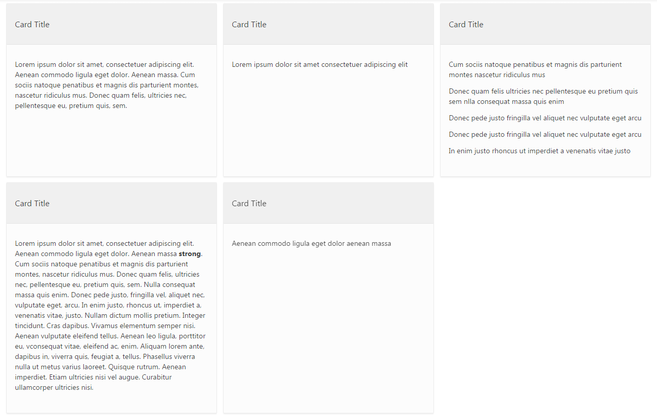
Result will look like this:

Now, let’s highlight the header when hovering a card.
Add following class to you region’s CSS Class Attribute: t-Cards--header-highlight and the following CSS to your page.
.t-Cards--header-highlight .t-Cards .t-Cards-item .t-Card:hover .t-Card-titleWrap{
    background-color: #c8102e;
}

.t-Cards--header-highlight .t-Cards .t-Cards-item .t-Card:hover .t-Card-titleWrap .t-Card-title {
    color: #fff;
}

.t-Cards--header-highlight .t-Cards .t-Cards-item .t-Card:hover .t-Card-wrap {
    border: 1px solid rgba(0,0,0,.05);
    box-shadow: 0 2px 2px rgba(0,0,0,.05);
}

/* Featured Style Padding/Margin Fix */
.t-Cards--header-highlight .t-Cards.t-Cards--featured .t-Cards-item .t-Card .t-Card-titleWrap {
    margin: 0 !important;
    padding: 24px 16px;
}

.t-Cards--header-highlight .t-Cards.t-Cards--featured .t-Cards-item .t-Card .t-Card-body {
   margin: 0 16px 24px 16px !important;
}
The second part of the above CSS is to change the cards’s margin to padding, we need to do this because the background-color is not affecting the margins, but it is for the paddings.
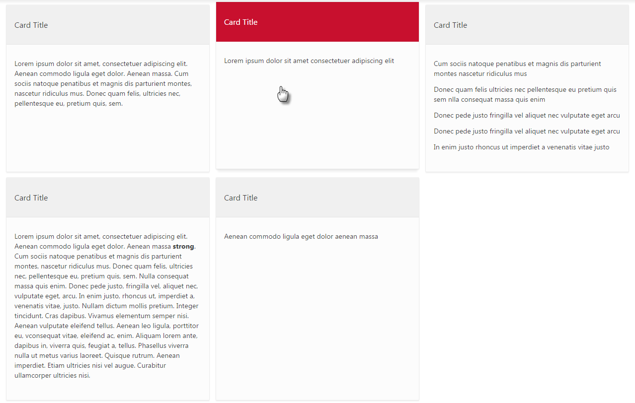
Result will look like this:

The above CSS works for all cards report styles (Basic, Compact and Featured).
You can have a look at my Demo Application
Edit:: Apex 5.1 displays cards with equal height by default.